Proof of Concepts Showcase
Welcome to our Proof of Concepts showcase, where innovation meets actionable insights. At Intelcraft Infotech, we leverage cutting-edge tools like Power BI, Tableau Desktop, Python and Google Looker to transform data into compelling stories that drive business success. From dynamic dashboards that offer instant data visibility to intricate data models that provide deep analytical insights and predictive machine learning models, our PoC projects demonstrate our commitment to delivering customized, high-impact solutions. Please explore our PoCs to see how we can turn your data challenges into strategic advantages, ensuring your decision-making is informed, agile, and ahead of the curve.
Please note: Only dummy datasets are used in all these PoC projects. After seeing our PoCs, if any future potential clients or companies are interested in partnering with us to develop BI & Data based solutions for them, or any students or companies(for their staffs) are interested to purchase & enrol for our Training Courses, please call (or WhatsApp) us on +61-470298065/+91-9342828085 or email us on info@intelcraftinfotech.com, to discuss about it further.
Power BI Dashboard Development Project: 1
The below Power BI dashboard(Proof of Concept) contains pages with Preliminary & Final Sales figures for last 4 months and Sales forecast figures for next 3 months. The dashboard is completely automated and it will automatically fetch last 4 months Sales data and next 3 months Sales forecast data, when the month changes, without the need for any manual intervention. This dashboard also comes with toggle buttons to switch between preliminary sales, final sales and sales forecast figures.
Power BI Dashboard Development Project: 2
The below Power BI dashboard(Proof of Concept) contains pages regarding MOBILE SALES ON A E-COMMERCE WEBSITE.
Power BI Dashboard Development Project: 3
The below Power BI dashboard(Proof of Concept) contains details regarding MOBILE USAGE AND OTHER DETAILS OF CUSTOMERS IN A PREPAID SIMCARD COMPANY.
Power BI Dashboard Development Project: 4
The below Power BI dashboard(Proof of Concept) contains details regarding SUPERMARKET SALES ANALYSIS.
Power BI Dashboard Development Project: 5
The below Power BI dashboard(Proof of Concept) contains details regarding WORLD POPULATION ANALYSIS.
Power BI Dashboard Development Project: 6
The below Power BI dashboard(Proof of Concept) contains details regarding an EDTECH COMPANY’S COURSE ANALYSIS
Power BI Dashboard Development Project: 7
The below Power BI dashboard(Proof of Concept) contains details regarding HEALTHCARE SECTOR ANALYSIS
Tableau Dashboard Development Project: 1
This ‘.twbx’ file contains a sample Tableau dashboard for an imaginary Telecom company and Dummy data is used to create this dashboard. Parameters, Filters, Calculations, Actions and many other features of Tableau are used to create this dashboard. I have added some customized charts like Pie chart and side by side bar chart with arrow marks in this dashboard.
Google Looker Dashboard Development Project: 1
The below Google Looker dashboard(Proof of Concept) contains details regarding MOBILE USAGE DETAILS OF TOP 10 CUSTOMERS IN A PREPAID SIMCARD COMPANY.
Python Data Science Project: 1
MODEL FOR DIABETES PREDICTION USING RANDOM FOREST CLASSIFIER MACHINE LEARNING ALGORITHM
Aim
Our aim is to predict whether people have diabetes or not, based on the input values, the users provide. Here the model is trained with the dataset which provides the vitals information. Based on the new input data, the model will predict the output for the new person.
Dataset analysis
The dataset can be found in the below link
Diabetes Prediction Dataset CSV file
This dataset contains diabetes status for a set of people based on the following factors.
- Gender
- Age: Age of the person
- Hypertension: If a person have high BP its 1 otherwise it is 0.
- Heart_disease: If a person have heart diseases it is 1 otherwise it is 0.
- Smoking_history: This gives details regarding whether the person is a current smoker or former smoker or non smoker etc.
- BMI: It is the Body Mass Index of the person.
- HbA1c_level: It is the Random Sugar Level which varies between 0 and 10.
- Blood_glucose_level: Blood Sugar level.
- Diabetes: Based on all the above information, it is the prediction whether the person have diabetes or not(target variable).
- Finding the gender distribution:
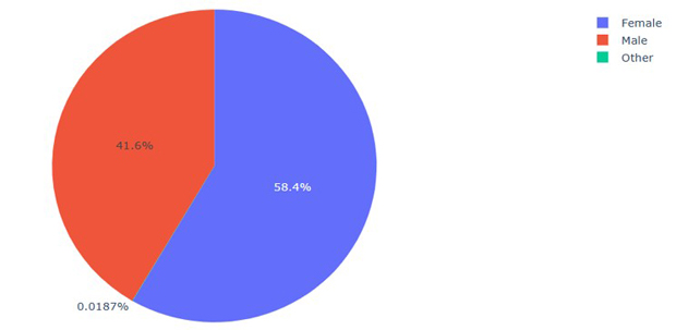
Fig 1: Gender Distribution
The above figure shows the number of people who are male and female. Here 41.6% of people is female and 58.4% of people is male and 0.0187% of people is others.
2. Diabetes distribution using HbA1c_level:
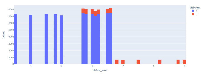
Fig 2:Distribution based on HbA1c_level
Here the diabetes level-HbA1c_level ranges from 0 to 10. So, by the analysis the HbA1c_level ranges from 0-5.7 is considered as non-diabetic for all range of people in all ages. The HbA1c_level ranges from 5.7 to 10 is considered as diabetic but have to consider the other features like age, health condition and their smoking histories. This feature plays a vital role in the prediction.
3. Analysis based on Smoking History:
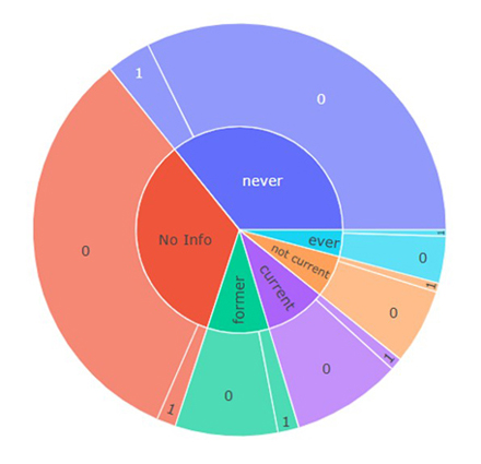
Fig 3: Distribution based on Smoking History
Based on the smoking history the distribution of the dataset is considered here. People are separated as no smokers, not smokers now, current smokers, former smokers and no information on smoking. Here in every segment people of some percentage is having diabetes and maximum are not. So this feature does not affect the output highly.
4. Diabetes distribution based on Age:
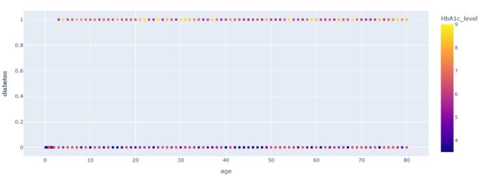
Fig 4: Diabetes distribution based on Age
Here the people are segregated by their age and whether they have diabetes or not. The color legend indicates the HbA1c- level of the people. Here the people in all ages are having diabetes from the range of 0 to 100.
5. Diabetes distribution based on BMI and AGE:
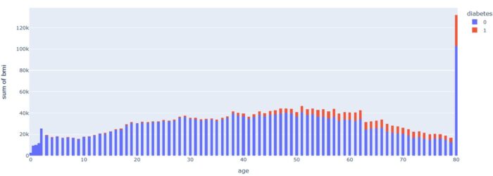
Fig 5: Diabetes distribution based on BMI and AGE
Here few people have diabetes in every range of BMI. But the number of people who have diabetes increased by age and BMI.
6. Distribution of features relationship with each other:
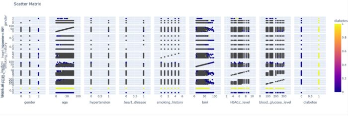
Fig 6: Distribution of features relationship with each other
Here the scatter plot explains the relationship of each feature with one another. So here we can analyze the relationship and dependency of each feature with other features.
7. Heatmap to find the Dependent variables:
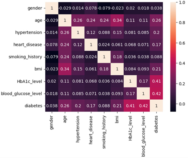
Fig 7: Heatmap to find the Correlation between Variables
This heatmap is used to find the dependent variables which affects the target variable.
If the value is near to 1, those 2 variables are positively correlated.
If the value is near to -1, those 2 variables are negatively correlated.
If the value is near to 0, there is no much correlation between those 2 features.
From this heatmap we can find that the features affecting the Diabetes variable are HbAIc_level, blood_glucose_level, followed by age and bmi
8. Model Selection for Diabetes Prediction:
After completing all the analysis the next step is to build the model using the suitable Machine Learning algorithm. Naives Bayes, Decision tree classifier, Random forest Classifier, Gradient Booster and XG Booster Predictive Models are tested in this dataset. By considering the accuracy, f1 score, precision value and recall values for the above mentioned predictive models, it is decided that Random forest Classifier predictive model will be used for this dataset for the prediction of diabetes.
The model build with Random Forest Classifier predictive model has
Accuracy : 96.99
Precision : 94.98
Recall : 69.00
f1 score : 79.93
The model is robust and not an overfitted or underfitted model. Now it is ready for prediction. The model gets the values for different features and the output is predicted from that.
Sample Output:
The final output value, generated using this model with given input values are as shown in the below screenshot, and it is
‘You DONT HAVE diabetes‘
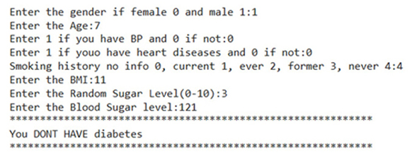
Please note: This project is completely done in Python using Google Colab. Lot of work is done on exploratory data analysis, data preparation, model selection, feature selection, training and testing of different models.
Python Data Science Project: 2
CUSTOMER SEGMENTATION USING KMEANS MACHINE LEARNING ALGORITHM
Aim
The aim of this project is to segment the customers of service sectors like bank, mall, companies etc. This is helpful to categorize the customers and to find the potential customers.
Dataset analysis
The dataset can be found in the below link
This dataset contains bank’s customer transaction details. The fields are given below
- TransactionID : An unique identifier generated for each Transaction.
- CustomerID : An unique Identifier for each customer of the Bank.
- CustomerDOB : Date of Birth of the Customer.
- CustGender : It provides information about Customer’s Gender.
- CustLocation : It gives details of the customer’s Location.
- CustAccountBalance : It gives customer’s account balance details.
- TransactionDate : It provides information about the date that Transaction was done.
- TransactionTime : It gives information about the number of times the Transaction has occurred.
- TransactionAmount(INR): It provides information about the amount transacted from that particular account.
- Data Analysis based on Dataset
1.1. Analysis based on Gender Distribution
The below pie chart is done for analyzing the gender distribution. From the chart, we can find that the bank has more male customers than female customers.
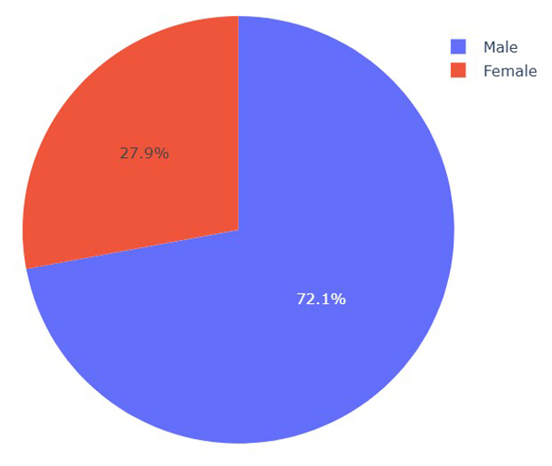
Fig 1: Pie- Chart on Gender Distribution
1.2. Analysis based on Customer’s Location
This chart gives a clear picture of which location has maximum customers. The below chart shows the top 25 locations that have maximum number of customers. Mumbai is in top with most number of customers.

Location
Fig 2: Bar Chart on Customer’s Location
1.3. Analysis based on Age of Customers
In the below chart, the age of the bank’s Customers is analyzed. From the chart we can find that, maximum number of customers are between the age range 20 to 30.
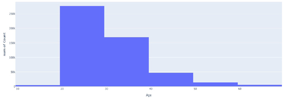
Fig 3: Distribution on Age of the Customers
1.4. Analysis based on Transaction Amount
Analyzing the transaction amount, gives knowledge about which amounts are transacted frequently or maximum times. From the below chart, we can find that amount between 300k and 400k is transacted maximum times.
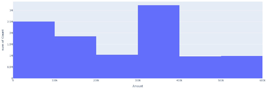
Fig 4: Distribution based on Transaction Amount
1.5. Analysis based on Account Balance
This chart gives information about customer’s account balance amount and its count value. The account balance amount of above 400k has the most count.
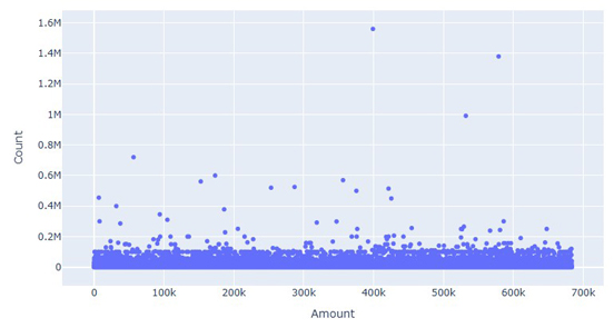
Fig 5: Count of Individual Account Balance Amount
1.6. Analysis based on Gender and Customer Location
The chart below provides information about the gender and the location of the customers.
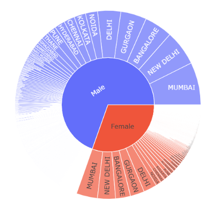
Fig 6: Chart based on Gender and Location
1.7. Analysis based on Age and Transaction amount
This chart helps to understand the relation between the transaction amount and the age of the customers. From the below chart, we can find that people with age above 25 and below 45 has high transaction amounts.
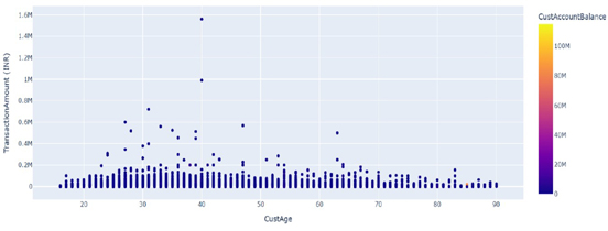 Fig 7: Scatter plot between Transaction amount and Customer’s Age
1.8. Heatmap of Features in the Dataset
The below chart shows the relationship between the features. Most of the correlation values are less than 0.1.
This is a Unlabeled dataset. Customers can be segmented using Clustering.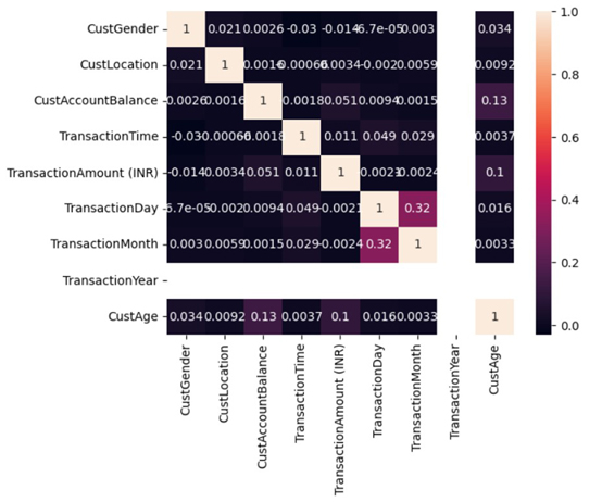 Fig 8: Heatmap of features in the Dataset
2.1. Model
Customers can be segmented using Clustering technique. This will group the customers based on the similarities between each other. Below curve is used to find the number of clusters by finding the sharp bend in the curve.
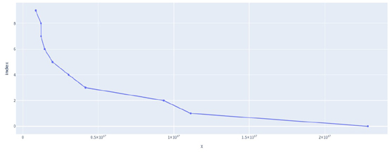
Fig 9: Chart between Number of Clusters and Sum of Squares
2.2. Scatter Matrix Plot based on various Features
The matrix plot is plotted for the features Cluster, Customer Gender, Customer location, Customer Age, Transaction Amount and Customer Account Balance. This plot is used to find which are correlated with the cluster.
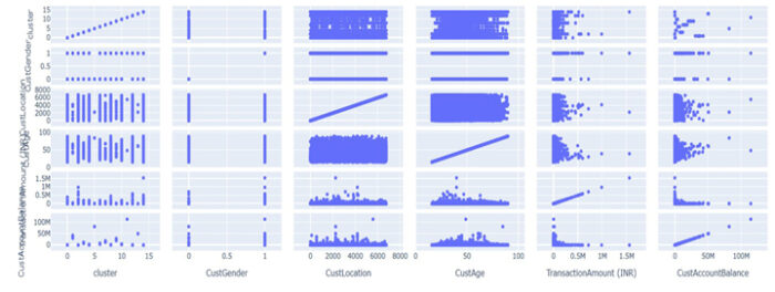
Fig 10: Matrix plot based on Different Features
2.3. Relationship between Customer Age and Cluster
From the below chart, we can find that the customer age is equally distributed in all clusters. So the Cluster is not segmented based on Customer’s Age.
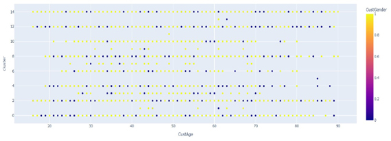
Fig 11: Relationship between Customer Age and Cluster
2.4. Relationship between Cluster and Customer Location
From the below chart, we can see that the Customer location is also equally distributed in all the clusters. So, the Cluster is not segmented based on the Customer location.
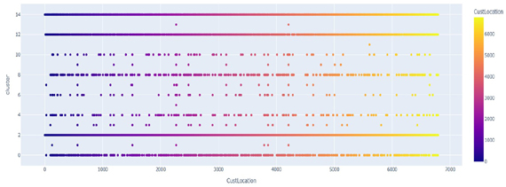
Fig 12 : Relationship between Customer Location and Cluster
2.5. Relationship between Cluster and Customer Account Balance
From the below chart it is clear that the clusters are grouped by the account balance of the customers. We can see that there are different clusters with different ranges of account balance.
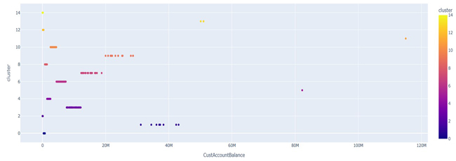
Fig 13: Relationship between Cluster and Account Balance
2.6. Relationship Between Clusters and number of Transactions
The Below chart gives the relationship between Clusters and the number of transactions. The number of transactions are also distributed equally in all clusters. So the cluster segmentation is not based on the number of transactions.
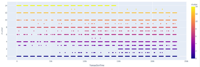
Fig 14: Relationship between Clusters and No. of. Transactions
2.7. Customer Segmentation
The customers are segmented based on their Account Balance. The number of Customers in each clusters are given below.

Fig 15: Clusters and the Customers Count
The Cluster 4 and Cluster 10 have less customers in the Customer Segmentation. These cluster’s data frame are given below.

Fig 16: Segmented Dataframe in Cluster 4
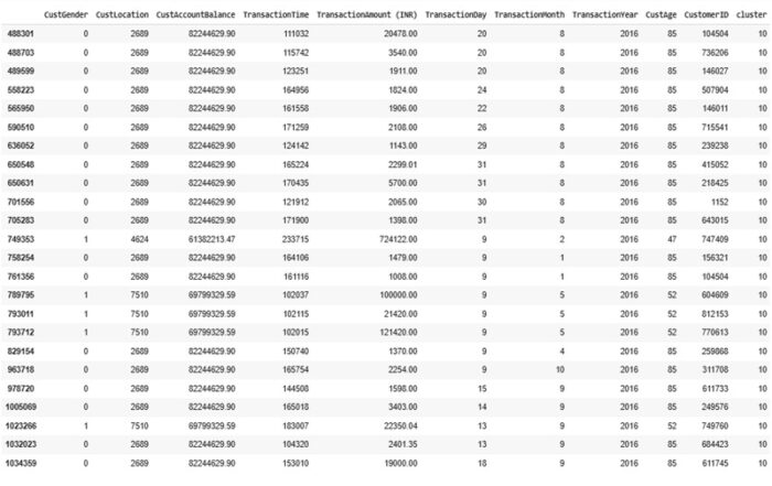
Fig 17: Segmented Dataframe in Cluster 10
2.8. Result
The Customers in bank are segmented successfully, which will motivate the bank to conduct further research on identifying potential customers who engage in frequent and higher-volume transactions.
Please note: This project is completely done in Python using Google Colab. Lot of work is done on exploratory data analysis, data preparation, model selection, feature selection, training and testing of the model.
Python Data Science Project: 3
ONLINE MOBILE SALES ANALYSIS AND SALES QUANTITY PREDICTION USING MACHINE LEARNING ALGORITHM
Aim:
The objective is to address a hypothetical business problem for an Online Mobile Seller. The seller is looking to sell mobile phones Online. For this, the individual is looking for the best product, brand, specification and deals, that can generate the most revenue with the least amount of investment and budget constraint.
Dataset Analysis:
The dataset can be found in the below link
This dataset contains mobile sales data for an Online seller, along with the features of the mobiles sold
Please note: The ‘sales’ column in this dataset which represents the quantity of mobiles sold is in hundreds. We can get the original number of mobiles sold by multiplying the ‘sales’ column by 100.
1. Analyzing the Mobiles Dataset based on their features:
1.1. Based on Brand:
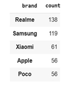
Fig 1.1: No. of Mobile Models by Brand
The above table shows the number of mobile models by brand, in descending order. From the table, we can observe that Realme brand has more mobiles models whereas Poco and Apple brands has less.
1.2. Based on Color:
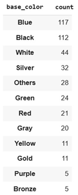
Fig 1.2: No. of Mobile Models by Color
Blue color is used in most mobile models followed by black color. Bronze color is used in less mobile models.
1.3. Based on Processor:
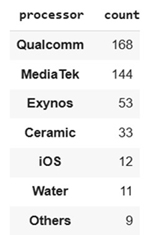
Fig 1.3: No. of Mobile Models by Processor
The Qualcomm processor is used in most mobile models followed by Media Tek processor.
1.4. Based on Screen Size:
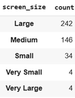
Fig 1.4: No. of Mobile Models by Screen Size
Large screen size is used in most mobile models, followed by medium screen size. Small or very small or very large screen size are used in less number of mobile models.
1.5 . Based on RAM used:

Fig 1.5: No. of Mobile Models by RAM used
4 GB RAM is used in most mobile models, followed by 6 GB RAM. 1GB RAM is used in less number of mobile models.
1.6. Based on ROM:
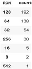
Fig 1.6: No. of Mobile Models by ROM
128GB ROM is used in most mobile models, followed by 64GB ROM.
1.7. Based on Ratings:
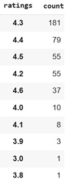
Fig 1.7: Based on Ratings
In online mobile sales mostly people like to buy products based on ratings. So ratings play a vital role in sales. Based on the dataset, we can observe that most mobile models got the rating 4.3 followed by 4.4.
2. Data Visualization Based on Mobile Sales Dataset:
2.1. Mobile Sales based on Mobile Price:
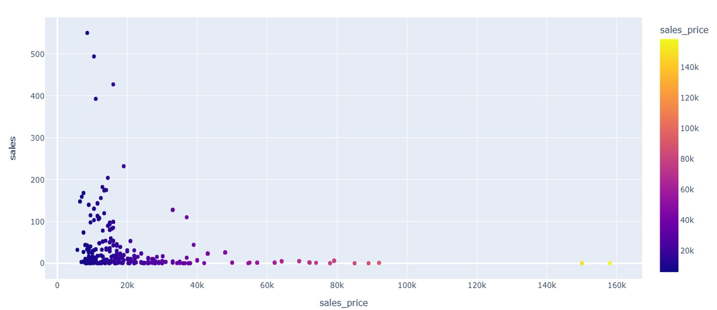
Fig 2.1: Mobiles Sold by Price
From the above figure we can notice that, more mobiles are sold between the price range of Rs.8,000 to Rs.25,000. Very few mobiles are sold above the price range of Rs.40,000.
2.2. Mobile Sold by Brand:
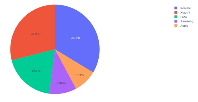
Fig 2.2: Mobiles Sold by Brand
As we can see the brand which is sold more is Realme followed by Xiaomi. Brands which are preferred less are Samsung and Apple.
2.3. Sales by Mobile brand and model:
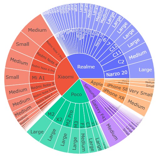
Fig 2.3: No. of Mobiles Sold by brand and model
The above figure shows the number of mobiles sold by brand and model.
2.4. Results based on Analysis:
After analyzing the dataset, we can find that the top-end & middle level mobiles are sold more. High end mobile models like Iphone and Samsung with 128GB RAM are sold more. People with budget of around Rs.20,000, mostly goes for Realme brand. The online seller can focus more on Poco brand, which have cheaper price mobiles with good dimensions, ROM and RAM capacity.
3.1. Heatmap to find the Dependent Variables
This heatmap is used to find the dependent variables which affects the independent variable. Here the Sales variable is the independent variable. The dependent variables are mostly No. of Rating followed by Color, Sales price, RAM, ROM etc.
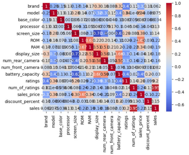
Fig 3.1: Heatmap to find the Dependent Variables
3.2. Machine Learning Algorithm selection for Predictive Model:
Random forest, Gradient Booster, XG booster and Decision tree algorithms are tested with this dataset and Decision tree algorithm is selected based on the following evaluation metrics
MAE: 162.93051858966172
MSE: 2093.276611328125
RMSE: 45.752339954674724
R-squared: 0.3693307638168335
With this algorithm, the model is modest and trained effectively.
Please note: This project is completely done in Python using Google Colab. Lot of work is done on exploratory data analysis, data preparation, model selection, feature selection, training and testing of different models.
Python Data Science Project: 4
MODEL FOR PREDICITING THE SELLING PRICE OF USED CARS USING DECISION TREE MACHINE LEARNING ALGORITHM
Aim:
Our aim is to predict the selling price of used cars based on different features that affect the price of the car. We have to train the most suitable machine learning algorithm with the data and create a robust model for prediction.
Dataset Analysis
The dataset can be found in the below link
This dataset contains selling price of used cars based on the following features.
- Car_Name : The model name of the car that is sold.
- Year : The car’s year of make.
- Selling_Price : This column gives information about the selling price of the car in lakhs.
- Initial_Price : This column gives information about the current market price of the car in lakhs.
- Kms_Driven : It gives information regarding the kilometers driven in that car.
- Fuel_Type : This field gives information about the fuel used, whether it is petrol or diesel or CNG.
- Seller_Type : This field gives information about who sells the car. A dealer or individual.
- Transmission : This field gives information about the car’s transmission, whether manual or automatic.
- Owner : This field gives information about the number of previous owners.
1. Comparison of Initial Price of the cars with their Selling Price
Here the initial price of the cars and their selling price are compared.
This comparison plot gives a good knowledge about which range of cars are sold more.
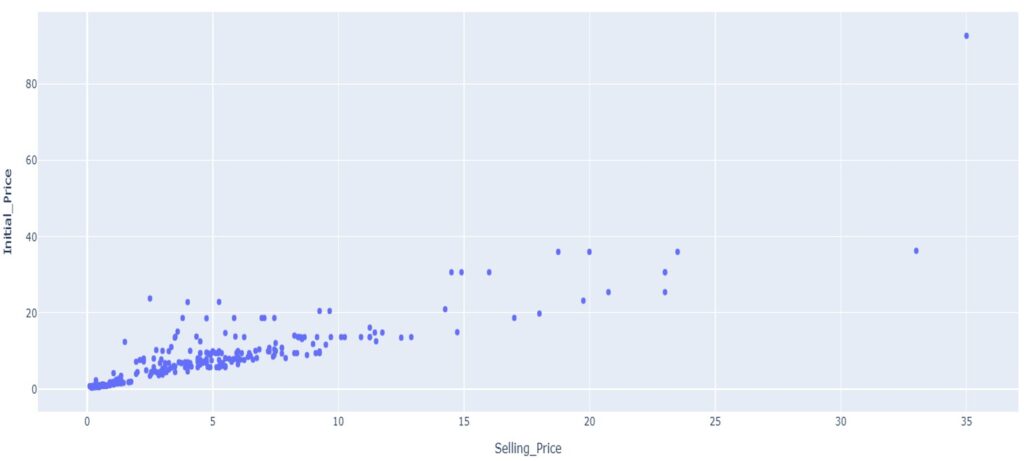
Fig 1: Comparison plot between Selling price and Initial price
2. Analysis between Kms Driven and Selling Price of the Cars
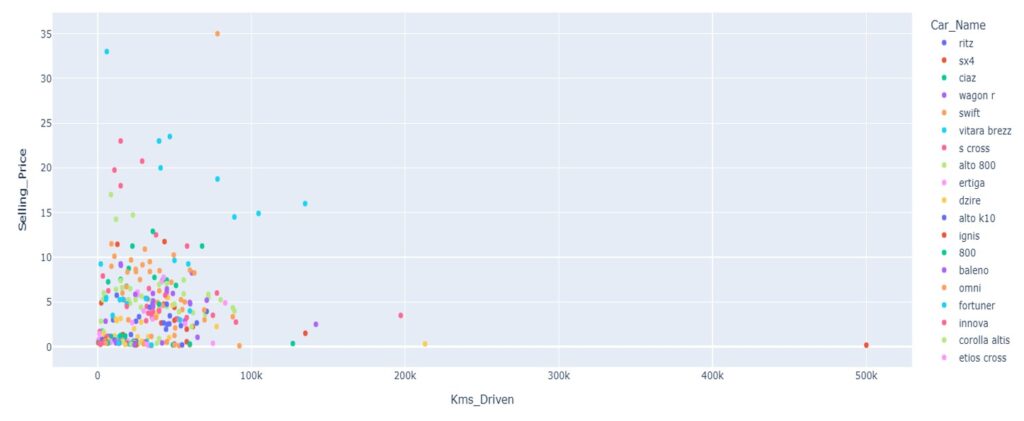
Fig 2: Plot between kms driven and selling price
The above plot gives the relation between the km driven by the car and its selling price. Here we can observe that according to the kms driven, the car’s selling price also varies. Please note that the color legend list displayed in this screenshot, don’t includes all the car names.
3. Analysis of Selling Price based on Car Model
This plot shows the car model name, its selling price and the number of cars sold. From this chart, we can find that cars like Land cruiser, Fortuner, Corolla Altis, Innova and Creta have high selling price. The cars that are sold the most are City, Corolla Altis, Verna, Brio and Fortuner. Please note that the color legend list displayed in this screenshot, don’t includes all the car names.
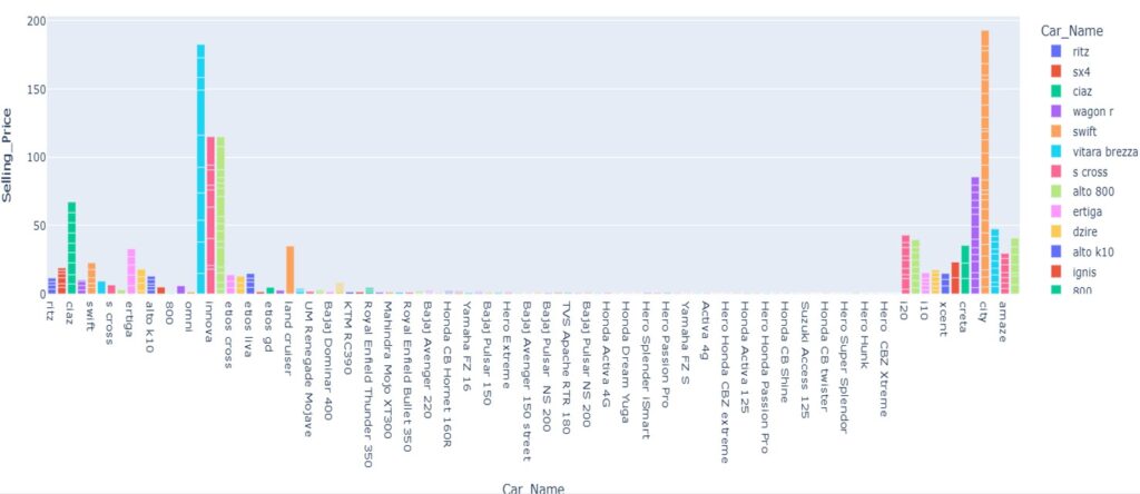
Fig 3: Plot about Cars, its Selling Price and its Count Sold
4. Analysis of total revenue generated based on the year of make of the car

Fig 4: Pie chart showing Revenue based on the year of make of Car
The year of make of the car plays a vital role here. This dataset has data till the year 2017. From the pie chart, we can see that the cars bought between 2014 to 2017 have generally generated more revenue.
5. Analysis based on the Vehicle’s Fuel Type
By looking at the pie chart, we can find that petrol vehicles are sold more compared to diesel vehicles. CNG vehicles are sold the least.
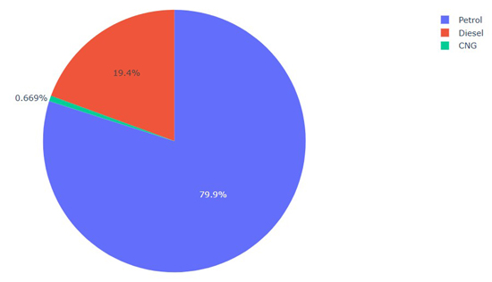
Fig 5: Pie Chart about Fuel used in the Vehicles
6. Analysis based on different features
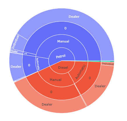
Fig 6: Overall Distribution of Sales based on different features
Here the features like fuel type, Transmission, Ownership and Seller type of the car are analyzed. Petrol cars with manual transmission, sold by first owners are sold more. Also cars are sold more by Dealers than Individuals.
7. Correlation between Independent Variable and Other Variables
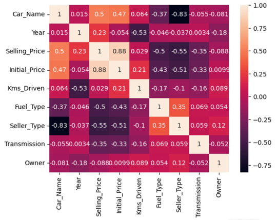
Fig 7: Heatmap to find the correlation between Variables
From the heatmap, we can find that there is high correlation between Selling price column and Initial Price column of the car followed by Car model. The selling price is negatively correlated to fuel type, seller type and transmission.
8. Model to predict the Selling Price of the Used Car
After the analysis, the next step is to build the model for the dataset to predict selling price of the used car. The output variable is continuous, so a regression model needs to be used here. We can consider different regression models like linear regression, random forest, gradient boost and decision tree regression models. If the model is robust then the R-square value should be near to 1.
Result:
The models are built and the selling price is predicted for the used car. The evaluation metrics for the decision tree regression are
Decision Tree Regressor Model Performance:
MAE: 1.08
MSE: 5.36
RMSE: 2.31
R-squared: 0.79
The above model is robust and better to predict the sales price for the used car.
By considering the evaluation metrics the best model for this dataset is Decision Tree Algorithm. The Prediction of Selling Price of a car for different input features is shown below.
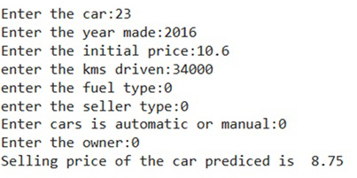
Fig 8: Predicted sales price for a used car
Please note: This project is completely done in Python using Google Colab. Lot of work is done on exploratory data analysis, data preparation, model selection, feature selection, training and testing of different models.
Python Data Science Project: 5
WEBSERIES RECOMMENDATATION SYSTEM USING NLP
Aim:
The aim of this project is to give suggestions on web series to the users based on their likes and interests.
Dataset Analysis
The dataset can be found in the below link
This dataset contains details about webseries and their streaming platforms. The fields present in the dataset are given below
- Series Title : The Name of the web series.
- Year Released : The year of release of the web series.
- Content Rating : Gives information about which age people should watch.
- IMDB Rating : Ratings given by the Internet Media Data Base website to the Movie.
- R Rating : The Rating given by the Motion Pictures Association of America to the web series.
- Genre : Information about the style of webseries.
- Description : Gives short notes about the webseries.
- No of Seasons : Gives information on how many seasons the series have.
- Streaming Platform : Gives information about where the webseries is streaming.
1. Analysis based on Genre Distribution
Using genre distribution, it is easy to find which genres people like and watch the most. The below figure shows the top genres watched in different streaming platforms.

Fig 1: Bar Chart about Genre Distribution
2. Analysis on Streaming Platform Distribution
The Data Analysis on Streaming platforms is useful for finding which streaming platform is used the most. The figure shown below gives details about streaming platform usage in this dataset.

Fig 2: Bar chart about Top Streaming Platforms
3. Analysis on Content Ratings
The dataset is analyzed based on Content ratings which specifies which age people can see the particular series. The below chart shows that webseries with 16+ years ratings are watched the most. Followed by webseries with 7+ years and 18+ years ratings. Webseries with 13+ years ratings are the least watched.
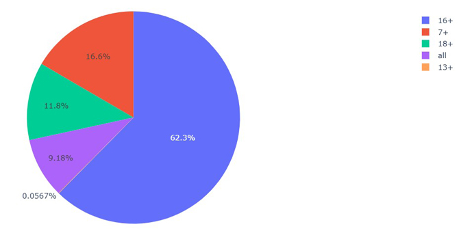
Fig 3: Analysis on Content Ratings
4. Analysis on IMDB Ratings
IMDB means Internet Movie Database. In this website every webseries has their own rating for their shows given by registered users of IMDB. Based on the chart below, most of the shows have the rating closer to seven.

Fig 4: Analysis based on IMDB Rating
5. Analysis based on R-Ratings Distribution
R-rating means Restricted Rating, which is given by the Motion Pictures Association of America. The below figure shows the distribution of ratings and its count. According to the chart, most of the webseries in this dataset have rating between 70 and 75.

Fig 5: Distribution based on R- Rating
6. Data Distribution based on Year of Release
The below graph shows the data distribution based on the year of release of the webseries. After the year 2000 the number of webseries released increased exponentially. Most number of webseries were released during 2017.

Fig 6: Distribution based on Year of Release of webseries
7. Analysis of IMDB Rating based on Year of Release
The below chart shows the comparison between the variables IMDB Rating and Year of Release. From this chart we can find that, there is no effect of year of release on IMDB Rating.

Fig 7: Distribution plot between Year of Release and IMDB Rating
8. Recommendation System for Webseries Using NLP
Webseries recommendation System considers every aspect like Genre, Cast, Content rating, Description and Streaming platform. After looking at all the features, the system will find the similarities between respective vectors(tokens). Vectors are nothing but keywords from all the features we considered.
The below screenshot shows the output of the recommendation system based on the webseries, that user likes. The system will give maximum of ten suggestions to the users to watch next.
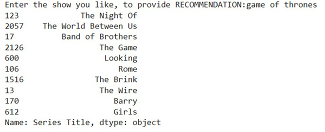
Fig 8: Model Output based on the SHOW you like
The below screenshot shows the output of the suggestion, got by the user based on the genre they like.
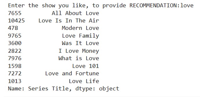
Fig 9: Recommendation of Webseries Based on Genre
9. Result
The Recommendation System for this webseries dataset is built successfully using the features title, cast, description and the streaming platform and works well.
Please note: This project is completely done in Python using Google Colab. Lot of work is done on exploratory data analysis, data preparation, training and testing of the model.
Python Data Science Project: 6
IMAGE PROCESSING BASICS AND DETECTING TUMOURS USING IMAGE PROCESSING TECHNIQUES
Aim
The objective of this project is to gain knowledge about the basics of image processing and automation on detecting the tumors in brain using image processing techniques.
Basics of Image Processing
The picture shown below is uploaded using the package called pillow. Pillow is a popular library that can be used to import image, process it and can be used to do many operations on it.
1. Importing Image
The first step is to import the image in the python notebook using the image processing package.
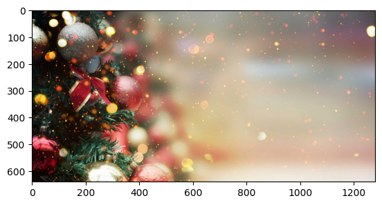
Fig 1: Importing image
2. Rotating image
The image can be rotated based on our need from 1o to 360o . Here the uploaded image is rotated by 180o.

Fig 2: Output of Rotated Image
3. Gray Scaling
Gray scaling is nothing but converting each pixel, that are in original color representation (RGB) to single intensity value ranging from black to white.
Here half of the image is gray scaled for showing the difference between colored image and gray scaled image.

Fig 3: Gray Scaled Image
4. Blur
This helps to blur the image or parts that you want to blur. The image shown below is fully blurred.

Fig 4: Blurred Image
5. Resizing the Image
The image can be resized using attributes in the size values. The length of the image is resized to half of it and height of the image is increased by twice the existing value.

Fig 5: Resized Image
6. Converting Gray scaled image to RGB image
Here the image which is shown below is already in gray scaling, is converted to image with primary colors. This will give a output of basic colored image with RGB colors.
The below picture is the gray scaled image to be converted.

Fig 6: Gray Scaled Image
The picture shown below is the converted gray scaled image after the primary color implementation.
Fig 7: Gray Scale Image to RGB Image
7. Detecting Tumor cells using Image Processing
Using Image processing techniques, is useful to find the tumors in the image.
It is an effective technique to find the small tumors in the body. Now we are going to find the tumor in the brain using image processing. First step is to import the image of the scan.
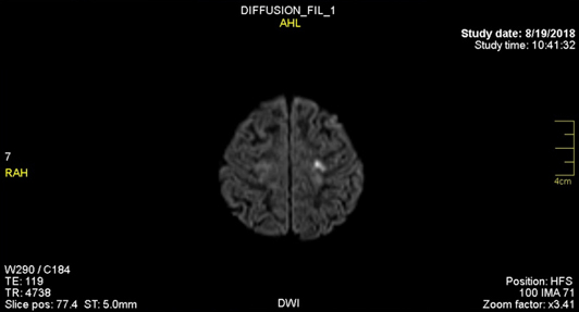
Fig 9: Imported Image of Brain
8. Heat map of the Image
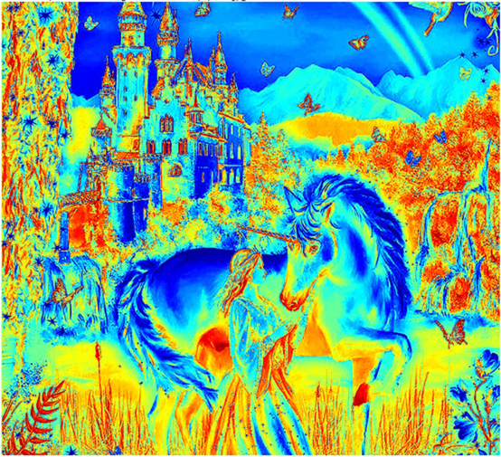
The heatmap is created to differentiate the tumor from the normal parts of the brain. Here tumor parts are in light color and other parts are in different colors. These are separated using the RGB values of the image.

Fig 10: Heatmap of the image
9. Highlighting the index values of the tumor
The below image gives the index value of the pixel grids which are with the tumor cells, by segregating the color range which are closer to white and grouping them together.
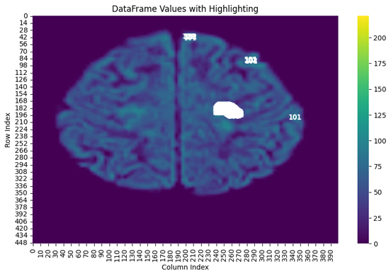
Fig 11: Indexing the tumor parts of brain
10. Identifying the tumor area using Image Processing
The scan image is Gray Scaled and the areas are selected to identify normal parts of the brain and the tumors. Based on the RGB values the pixels are checked and the tumor areas are identified and indicated with color to differentiate it.
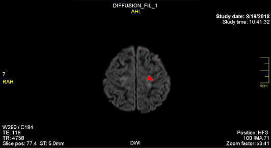
Fig 12: Identified Area of tumor in brain
11. Differentiating the tumor and normal brain parts
To get a clear view and to identify the tumor parts, the brain area and tumor area are differentiated with different colors. By this, we can find the percentage of area that has tumor.
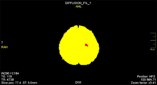
Fig 13: differentiating tumor cells from normal brain parts
12. Result
Here the basic knowledge about image processing is gained and the tumor in found using the image processing technique. The size of the tumor can also be found using this technique.
Percentage of clot is: 0.495%
13. Applications of Image Processing
Image processing is widely used in
- Face identification.
- Image to Text conversion
- Object Detection
- Hand writing Detection and etc.
Please note: This project is completely done in Python using Google Colab. Lot of work is done and techniques are used in image analysis, image preparation and image processing in this project.